Rolls-Royce reveals Pentagram's digital-friendly id
The luxury car brand has brought a nifty version of its Spirit of Ecstasy emblem to the forefront of its new visual identity from Pentagram, including abstract visualizations and a streamlined word mark
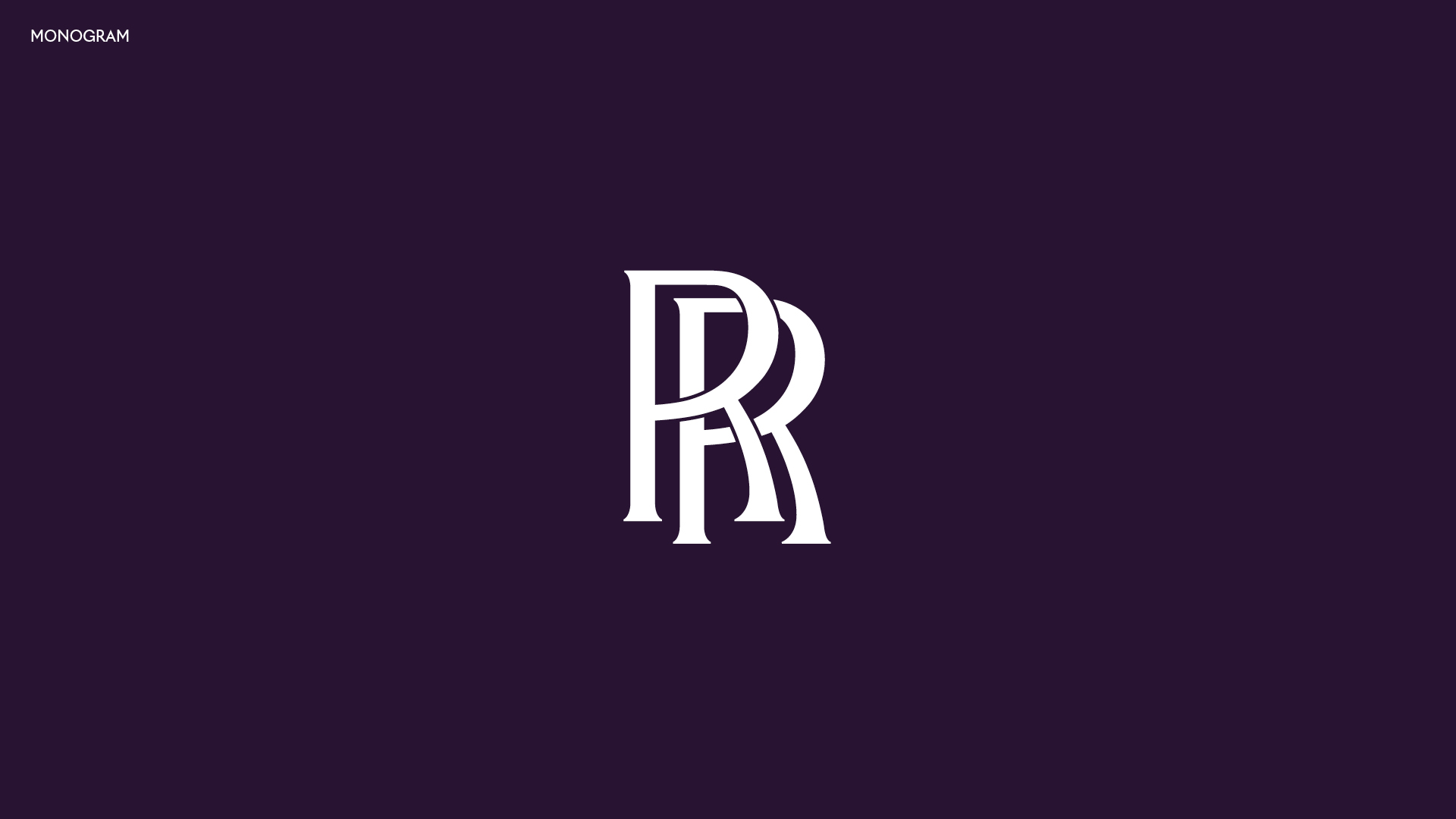
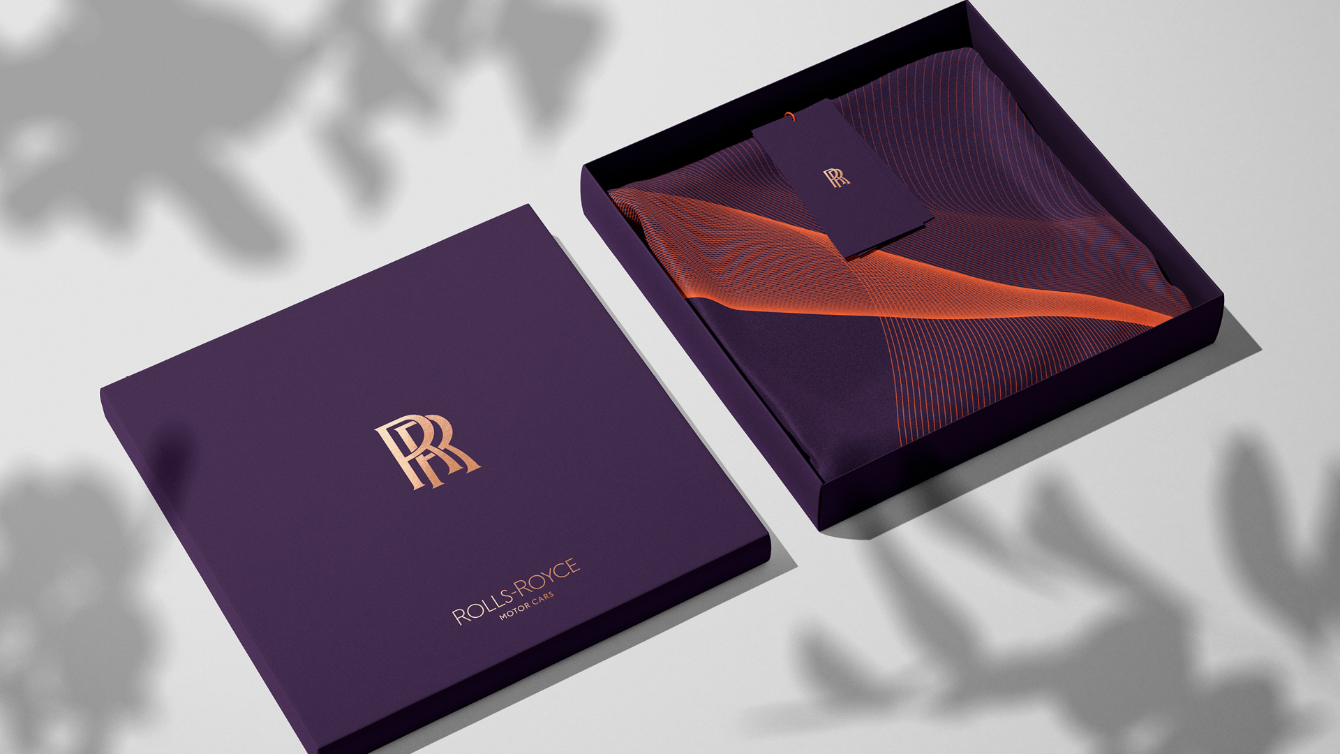
In a branding update led by Marina Willer and her team at Pentagram, the Rolls-Royce RR monogram remains unchanged. However, it has been downgraded in the new visual identity as the brand's Spirit of Ecstasy motif becomes the main logo of the Motor Cars division.
While much of the 3D detail has been reduced to digitally render the logo, the shapely figure still retains some semblance of depth, which is a refreshing change from the approach many other car brands have taken recently.
The updated logo has an additional base under the figure that reinforces the reference to the ornamental sculpture on the bonnet. It also comes with a tweaked silhouette that was carefully redefined as claims about women's bodies became ripe for criticism.
Perhaps the most notable change is the direction of the logo, which has been flipped horizontally to channel the idea that Rolls-Royce, despite being a traditional brand, is forward-looking.
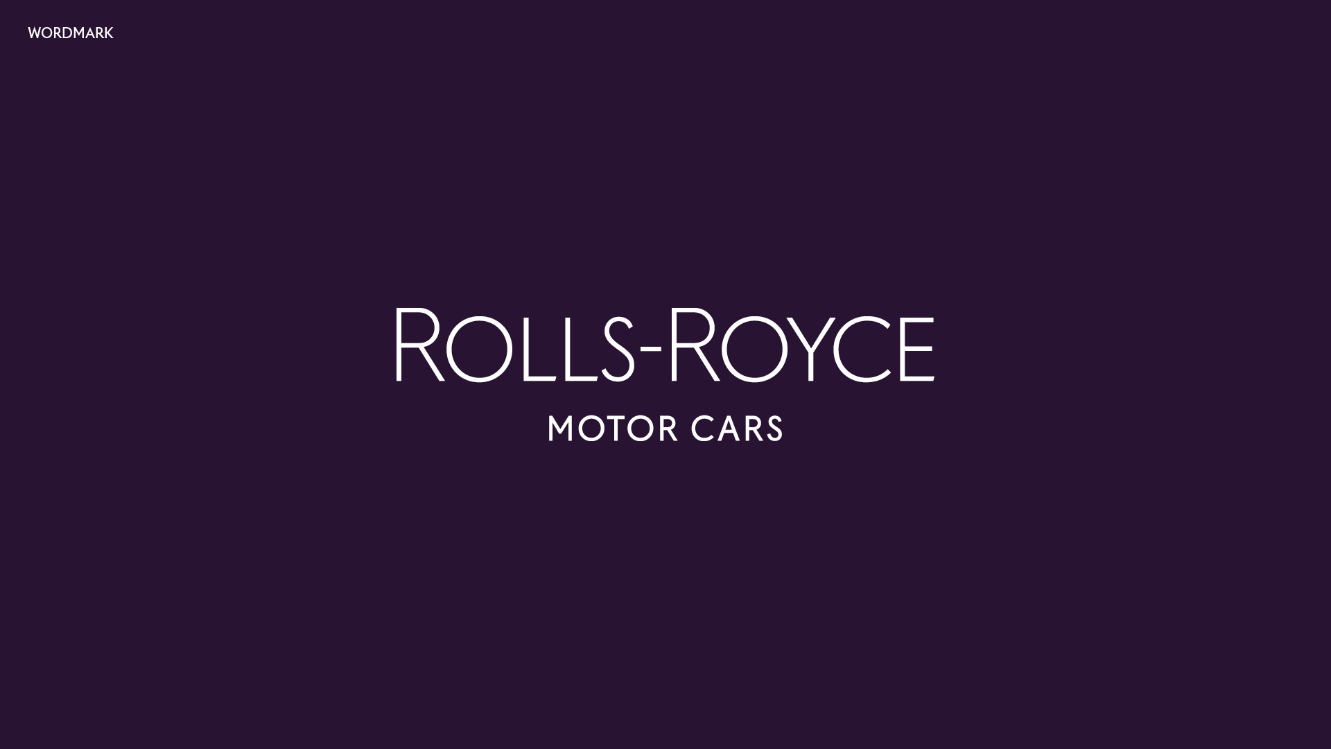
That approach has been filtered into the new word mark, which now has angled details in L and E to give a sense of movement quietly. The adjustments to the word mark are based on a historical iteration and while looking subtle, they now look less John Lewis and more Liberty.
The new look also features a linear, abstract visualization of the Spirit of Ecstasy motif that once again retains a sense of body and depth and contrasts most of the recent vehicle renaming, such as the new flat BMW logo.

pentagram.com