The Olympic model will get a refresh
Every four years, the world watches on as the next host country of the Olympic Games is announced. The anticipation surrounding that announcement is closely followed by the reveal of the design identity for each Games – an occasion that gets designers talking as much as the general public.
The design heritage for the Olympic Games is so illustrious that it’s easy to forget that the Olympics has a brand of its own to look after. And since the last development of its identity, in 2011, the organisation’s needs have evolved, explains May Guerraoui, the IOC’s head of brand management. So began an extensive process to evolve the brand, which has been revealed through a gradual rollout, and is expected to be implemented in full by the Paris 2024 Games.
One of the core aims has been to bring consistency across all touchpoints, particularly in digital contexts, to ensure the Olympic brand comes across as “relevant and credible”. But that bid for consistency only works if people across the organisation embrace and implement it, Guerraoui tells us: “The project therefore had to be wide-reaching, collaborative and include all IOC departments, and with a big organisation that can be a challenge in itself.”
The Olympic colours – second only to the iconic interlocking rings in terms of recognisability – have been “subtly optimised” to have more impact and flexibility, she explains. These have been joined by an extended palette of complementary colours reflecting the gold, silver and bronze medals, to be used for cases like data visualisation and infographics.
Top: Image by Naoya Suzuki; Above: Illustration by Karan Singh
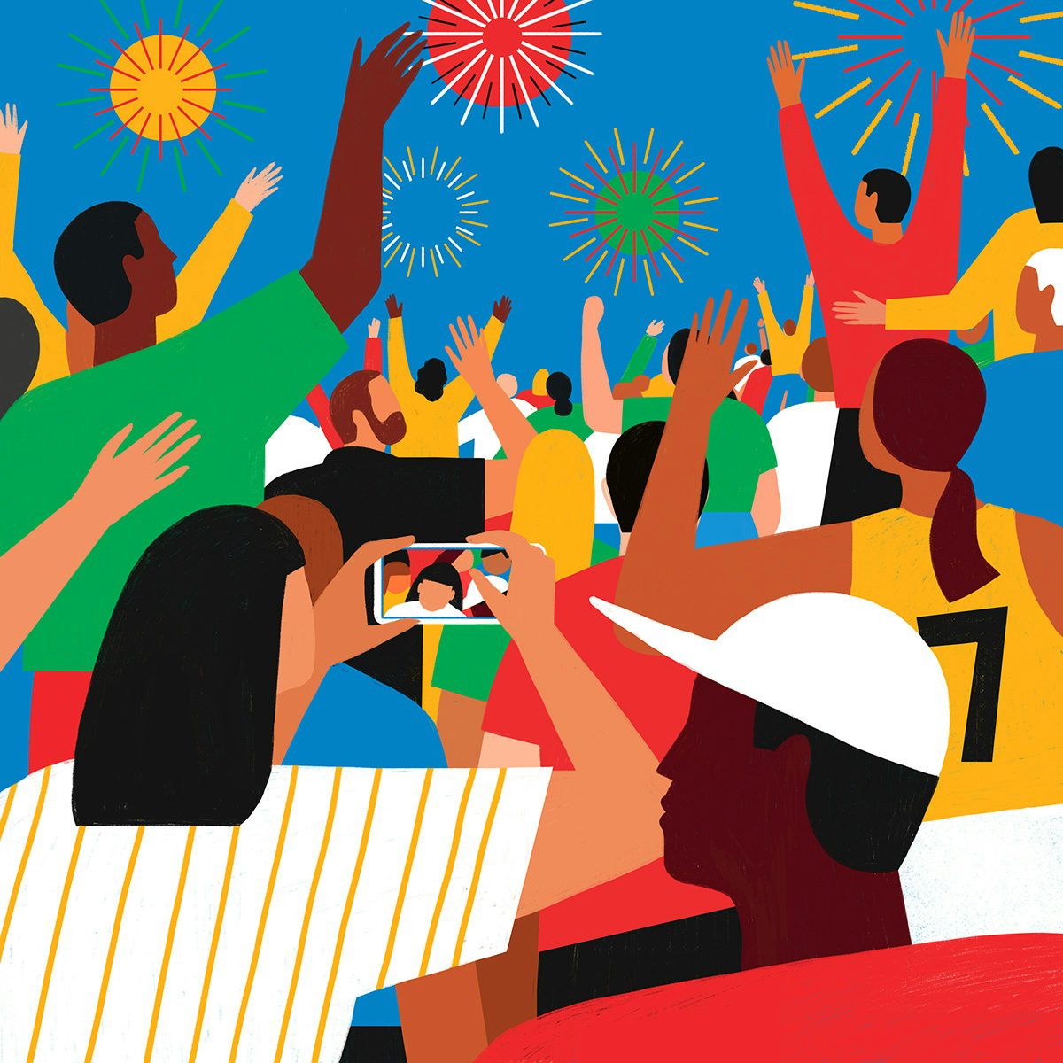 Illustration by Abbey Lossing
On top of evolving the brand’s existing core assets, the process involved the development of new elements, including three new bespoke typefaces by three typographers, one of which can be seen in the redesigned logo lock-up. The broad suite of illustrations has also been created by three different people, and help to convey themes and ideas that are difficult to express in photography.
“Art and creativity have played a big role in Olympic history, and not only in the iconic Olympic Games’ design. From 1912 to 1948, art competitions were held alongside sport – with Olympic medals awarded to architects, poets and artists,” Guerraoui says. “We wanted to bring this idea of championing the arts back into the brand identity.”
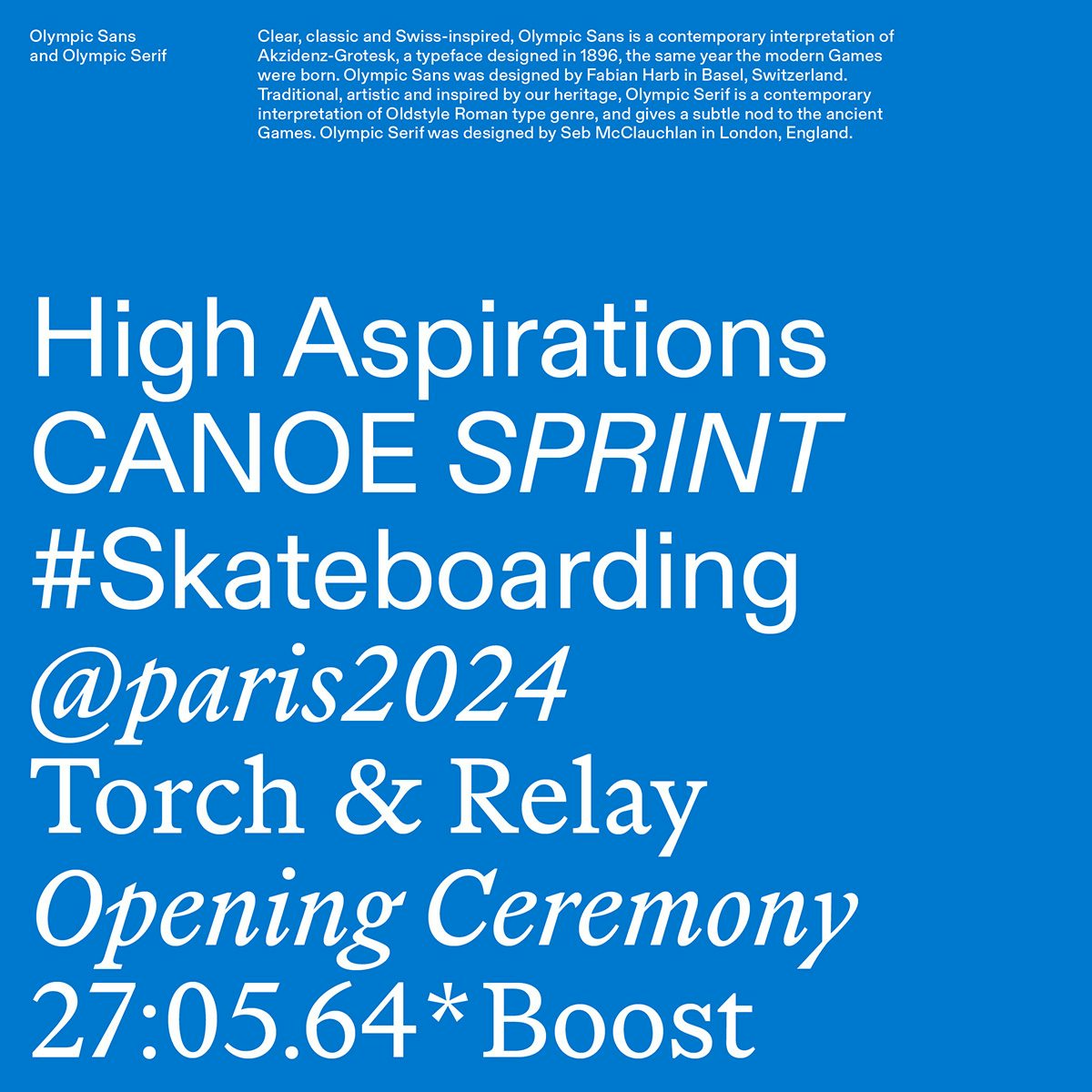 Olympic Sans was designed by Fabian Harb; Olympic Serif was designed by Seb McClauchlan
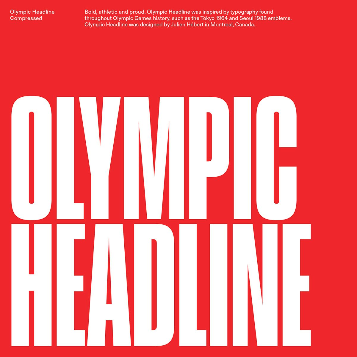 Olympic Headline was designed by Julien Hébert
A new catalogue of pictograms will be rolled out in the coming months, which were created with “strict 45- and 90-degree angles, a uniform radius and consistent line weights” for universal recognisability. Guerraroui explains that “the first systematic pictograms were introduced at the Olympic Games Tokyo 1964, when people from all over the world came together for the first Olympics in Asia. Since that pivotal moment, each Games edition has produced its own iteration of the icon system, applying a new style to reflect the culture of the host city.
“The universal pictogram system we have developed builds on the groundwork of Olympic history with pure geometry and a precise visual rhythm. A language-neutral, gender-neutral icon system built for today’s needs.”
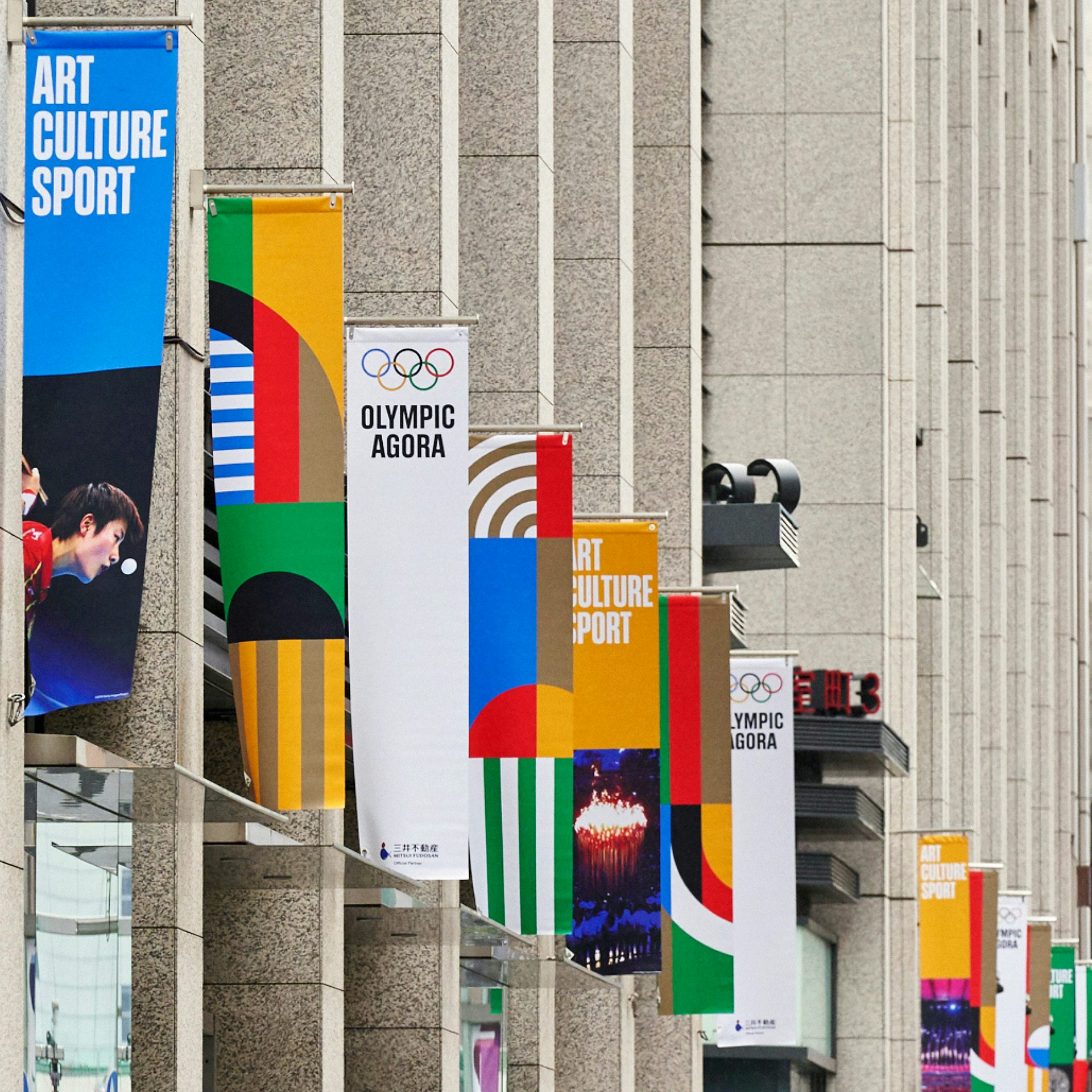 Image: Naoya Suzuki
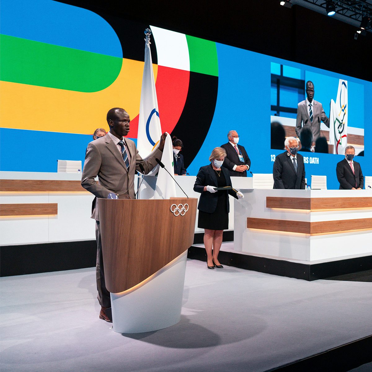 Image: Greg Martin
A new approach to graphic devices emphasises sport, athletes and the patterns found across the Olympic Games.
“For example, we have put the athletes at the heart of the evolved identity system with the Field of Play (FOP) design, a graphic system that expresses the Olympic brand through colour and geometry inspired by the Games,” Guerraroui says, from courts to tracks to lanes. “It was a way to incorporate the Games into the brand in a timeless way, without featuring a specific athlete or moment in a way that a photo would for instance.”
Although many of these choices were made with digital touchpoints in mind, the entire project was a “balancing act between tradition and modernity, print and digital, building a strong identity while also allowing flexibility”.
The design history associated with individual Olympic Games was “stimulating”, says Guerraoui, and inspired several choices throughout the process, such as the display typeface which nods to the Tokyo 1964 and Seoul 1988 emblems. However, it was important to create an overarching brand identity that sat in isolation, she says – “something timeless that didn’t single out any specific moment or place”.
olympics.com
